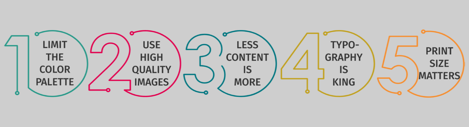
Top 5 Marketing Tips on Effective Print Design
Did you know that print marketing started nearly 200 years ago? Seems like a pretty long time for a marketing method to establish its place as a robust promotional tool, right? Although global digitalization made traditional marketing a less compelling point on the business landscape, print design is still in very high demand.
Businesses just can’t “live” without printing stuff about their products or services. Be it a small restaurant chain, or an IT agency, print design is quite essential when it comes to selling your product.
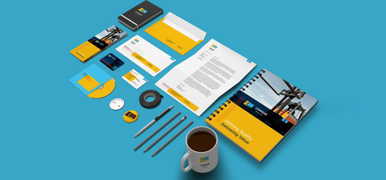
Business materials like banners, posters, flyers, business cards, or even interior items such as mugs and coasters, are the must-have ones when it comes to conveying business information. They are the paramount tools that create social buzz about your product and services whether it’s for trade shows or for general uses. But, a much more important point here to focus on is how to design your print materials elegantly, and how to make them persuasive, marketing-wise.
Let us give you some tips below on how to have really effective print designs with staying power:
1. LIMIT THE COLOR PALETTE.
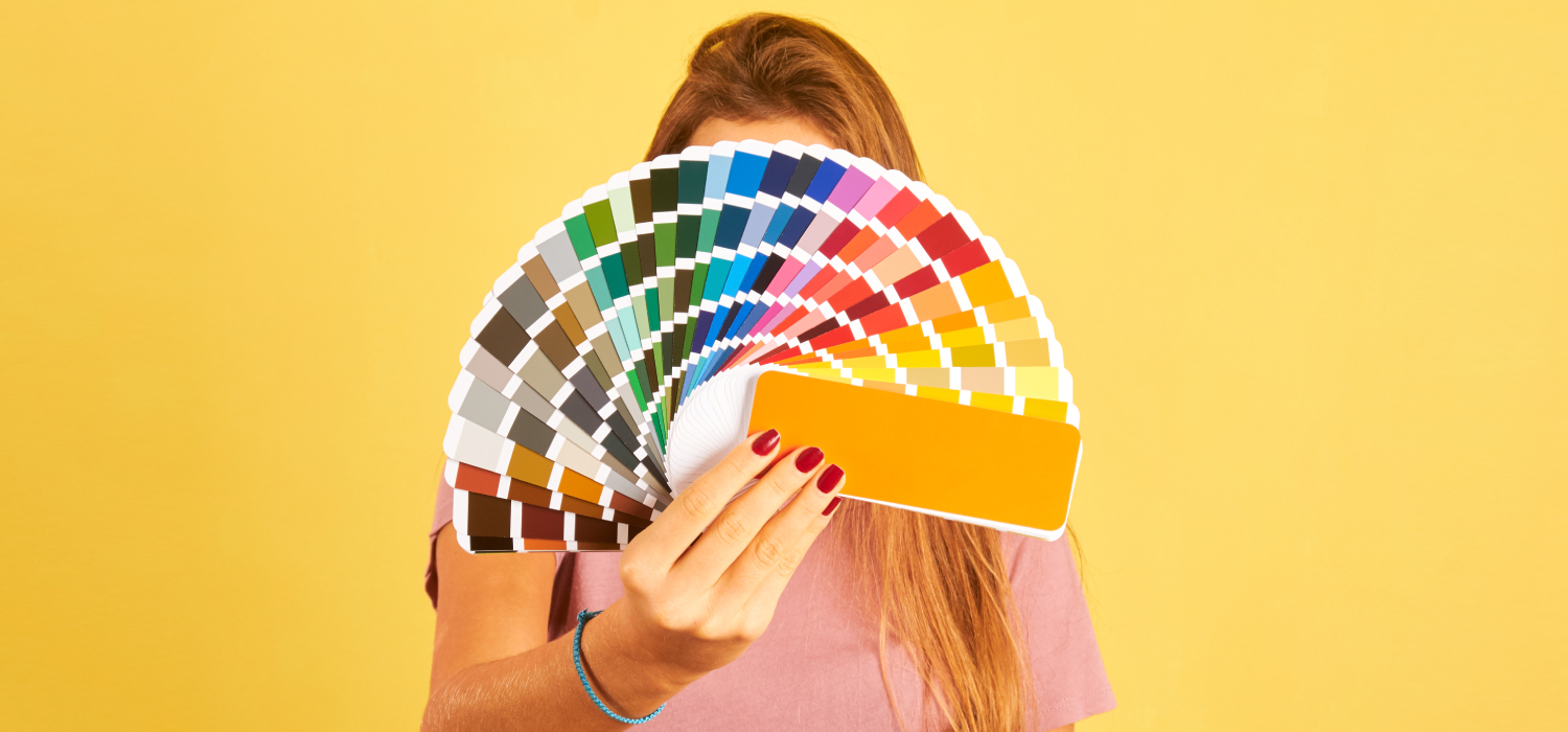
Who is not obsessed with colors? We see the world in them! Colors make everything much more lively and animated. But, when used too much or not in a way that is easy to process for the viewer, better not to take the risk of playing with colors. Especially, when it comes to packaging, too much variety of color palettes might even confuse the customer. It will distract them from paying attention to what your product really offers them.
2. USE HIGH-QUALITY IMAGES.
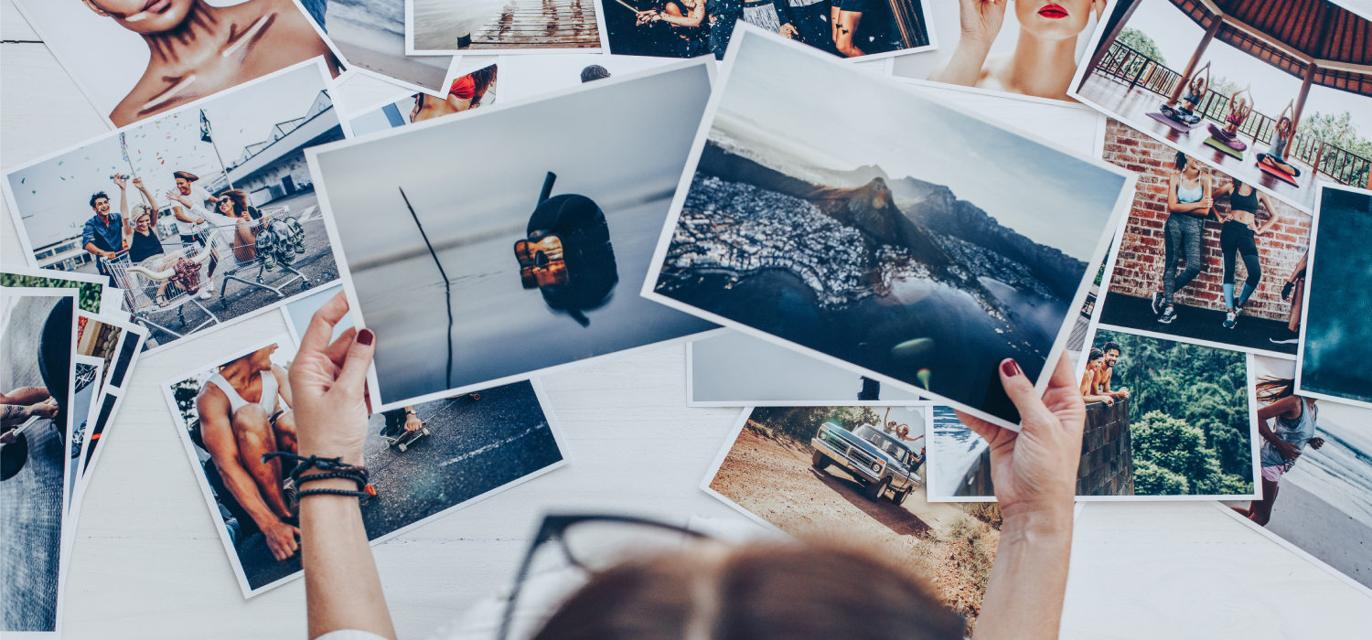
When the main image of your print is blurred, the other elements of your product won’t even matter that much. Avoiding a pixelated, low res photo is crucial when it comes to quality print design results. Especially, when it comes to printing large-scale formats, the impression it leaves on the viewer highly depends on the quality of the images. Make sure to always use the original high resolutions and sizes. They make the print easy to read and satisfying to the eye!
3. AMOUNT OF CONTENT: LESS IS MORE
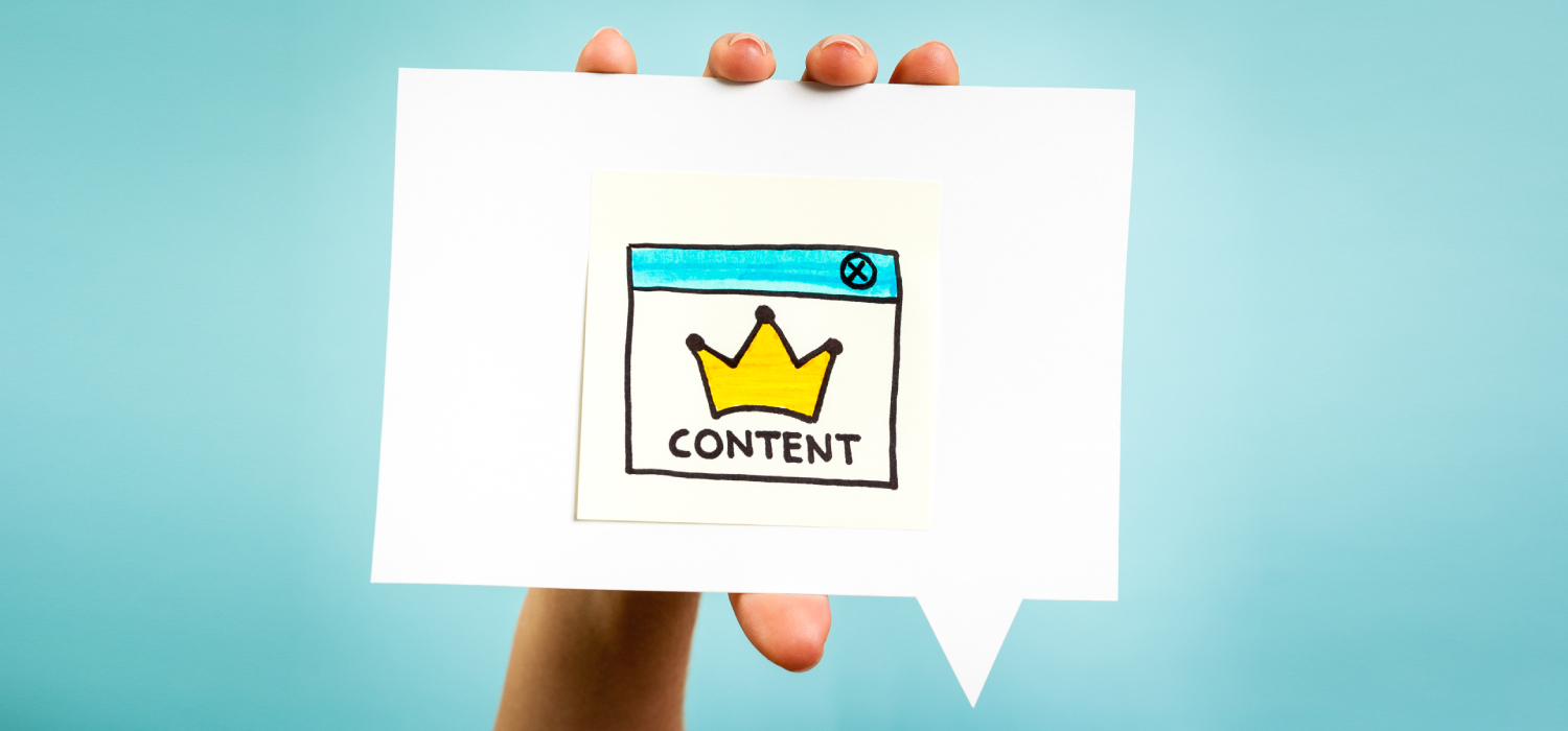
Along with the color palette limitation, other types of content that are included in the print design are accordingly important! The key factors here are to ensure that Call To Action is visible enough, yet the other unnecessary stuff is as limited as possible. The more content there is to process, the bigger the risk to make your campaign clash. It’s time to embrace your inner minimalist! Define what is essential for your campaign and what is the visual distracting noise as, at the end of the day, you do not want to overwhelm your audience, do you? 😉
4. TYPOGRAPHY IS KING
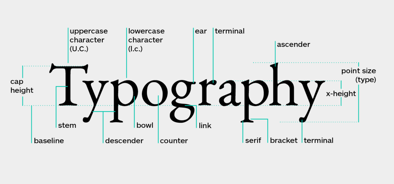
Have you already decided on the tone of voice of your campaign, or your brand, overall? Well, that’s what is defined by your font as well. Play that tone in your head that you are going to talk with your customers. And, then try to visualize it with the fonts for your texts. Fonts are the main elements in print design that set the right tone of voice and communicate with your audience, so make sure the typography setup is good!
5. PRINT SIZE MATTERS
Even though print and packaging design allows you to get creative and think outside the box print size really matters. But, it depends on the product, as well. Think twice when picking a size of the image before having it printed on the T-Shirts, on mugs, on coasters, and on notebooks as the sizes are different for each case. If you’re not a professional designer, surf the web in search of the right sizes for your purposes.
To sum up, when we think of a particular brand, the very first thing that comes to our minds is the print design elements it is associated with. This is why you should print the materials in a smarter way. In the end, it’s the good design that can be the reason for people to buy or don’t buy from you. Using a tip or two we mentioned above will already give you a wow-worthy print design for your next campaigns. Good luck!
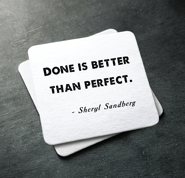
Coasters can serve as a great motivation for the employees, especially when most of them start their days with a cup of coffee. Here are some ideas you can use to keep your team’s spirit as high as it should be.
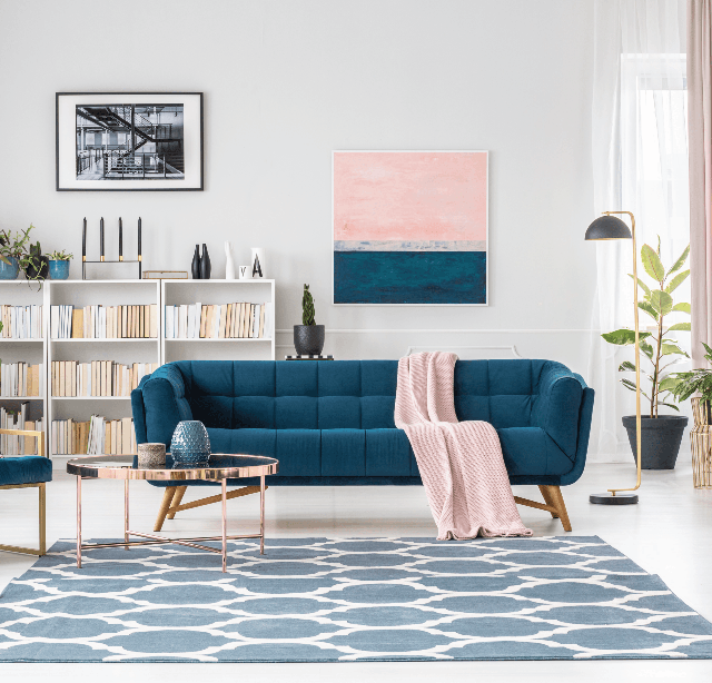
Custom printed carpets are a versatile accessory, and here only five ideas to prove it. Carpets are a great branding idea, useful addition to your room.
As a teenager, I covered up all my bedroom walls with posters. And it was sweet! And then came a time when I thought it was ridiculous and immature.